NCDSGNS Pro
A rounded techno display typeface designed in-house, used across NCDSGNS brand work, poster systems, and music visuals since its first cut. This page runs on the actual font file.
A typeface built to carry the brand.
Most design studios license a typeface. A smaller number commission one. Fewer still draw their own. NCDSGNS Pro is the third category: a custom display cut drawn in-house, expressly to carry the NCDSGNS visual voice across projects where a stock typeface would flatten the work to something generic.
It began as a sketchbook study in rounded geometric construction, then moved into a proper digital draw and a full character set. The rationale was simple: if a brand voice is going to read as specific, it should be carried by letterforms that are specific too. A studio's fingerprint lives in the things it doesn't hand off to a licensee.
NcdsgnsPro-Regular.otf file, embedded in this page via @font-face. What you're reading is the actual typeface, not a stand-in.Design traits, where the personality lives.
The face sits in the rounded-techno family. Stroke behavior is modular; terminals are soft; counters are open and generously weighted; cutaways and interior strokes carry a light mechanical logic without tipping into full stencil. It reads as engineered before it reads as decorative.
The numerals are where the character is most legible. Each digit is drawn for presence at size. They behave less like companion glyphs and more like display characters in their own right, which makes the face well-suited to track listings, album credits, issue numbers, and sequence-heavy editorial work.
Scale behavior, how it holds across sizes.
The face is explicitly a display cut. Its intended home is large: hero type, title cards, poster heads, cover lockups, motion frames. Below is how it renders at decreasing sizes, all drawn from the same embedded font file.
The glyph set, complete character family.
The cut now includes a full uppercase and lowercase Latin set, numerals, and a working symbol inventory. Letters hold their shape at display weight without optical collapse, and the spacing is tuned for headline settings rather than body text.
Applications, what the face does in the wild.
The face has carried display type on posters, album lockups, motion title frames, and interface surfaces across NCDSGNS client and self-initiated work since its first cut. Three application registers it holds particularly well:
Sector-X Live
Commanding display voice for event graphics, album campaigns, and launch posters. Large-scale letterforms hold their weight without collapsing at projection scale.
System UI
Loading screens, dashboards, product reveals, and futuristic interface labels when used sparingly at larger sizes. The geometry suits system language.
Brand Lockup
Anchors visual systems for experimental studios, music brands, apparel capsules, and creative-tech concepts that need a signature voice.
The original specimen, print artifact.
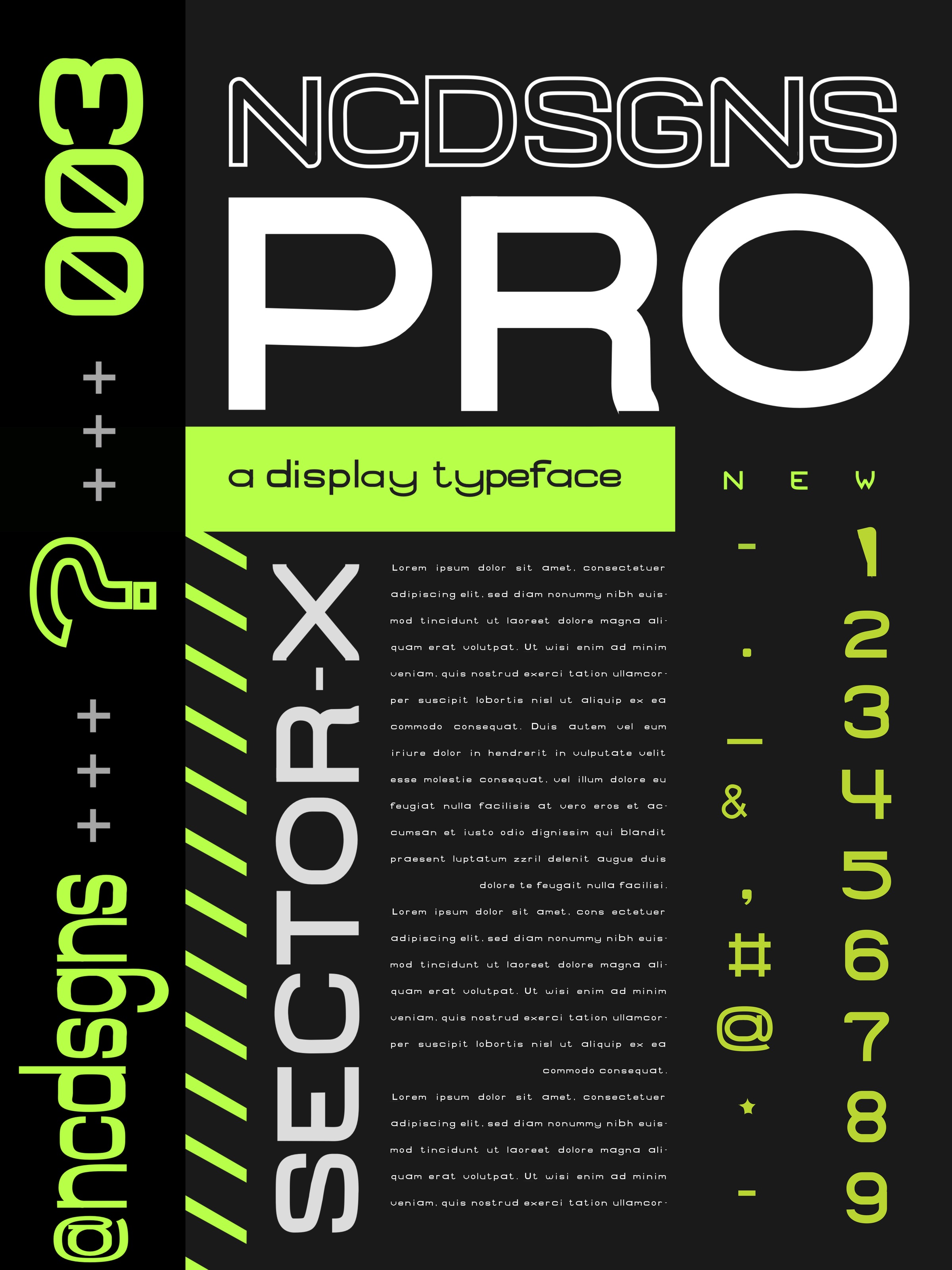
Issue 003, ncdsgns, a display typeface.
The original specimen sheet was designed as the physical companion to the font file: acid-lime on black, with the face's character set, numeral grid, and a Sector-X paragraph setting used to stress-test how the letters behave when spaced as body copy.
The sheet works as a print artifact in its own right. A PDF edition runs to 18 inches at archival resolution; the compressed web version above is linked from the live page.
Licensing is renting someone else's voice. A face drawn in the studio is a voice the studio owns. It's why this one exists.