
An original brand system, built to full depth.
A complete brand identity concept developed for CloudCore Technology, a cloud-infrastructure company that needed a full brand overhaul. Logo family, wordmark, applied surfaces, motion, and the built artifacts that show the identity at the scales it actually has to live at.
A full brand identity, end-to-end for CloudCore Technology.
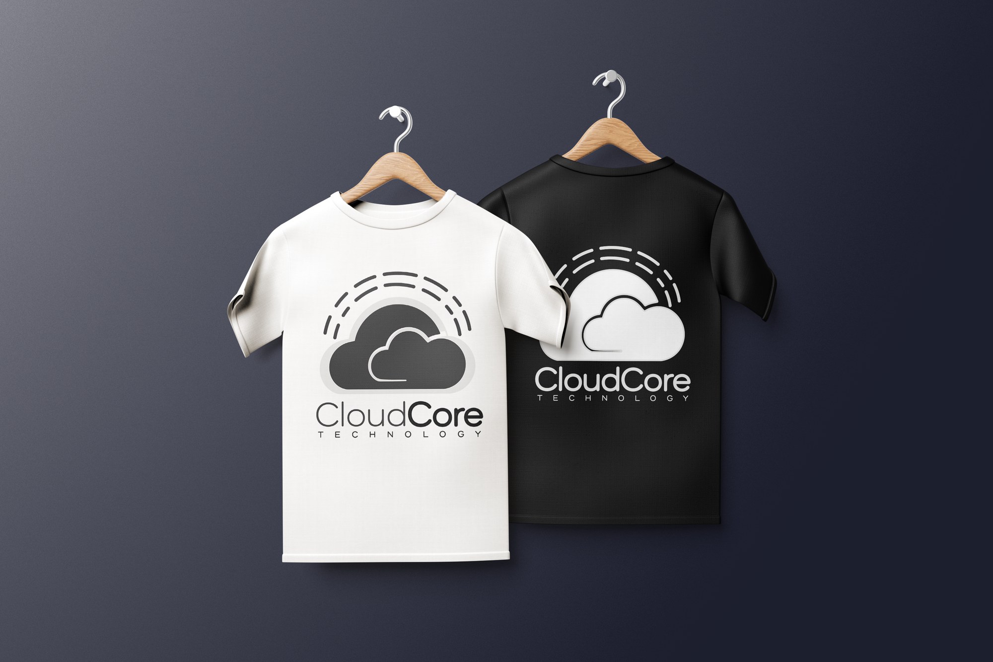
CloudCore Technology came to the work needing a brand overhaul. The engagement returned a full identity concept built from the first symbol all the way through to environmental signage. Logo family with four variants, complete wordmark treatment, stationery, apparel, tiled pattern system, motion version of the mark, and applied surfaces designed for every context the brand actually has to perform in. The system stands against any established identity in the cloud-infrastructure category because it was built to that standard from the first sketch.
This is what a comprehensive brand engagement with NCDSGNS looks like: strategic concept, complete visual system, and applied surfaces designed and built to show the brand at the scale and contexts it actually has to live in. The building render below is what the identity looks like at lobby scale, the same care and precision that goes into a single business card extended to the largest physical canvas a brand will ever sit on.
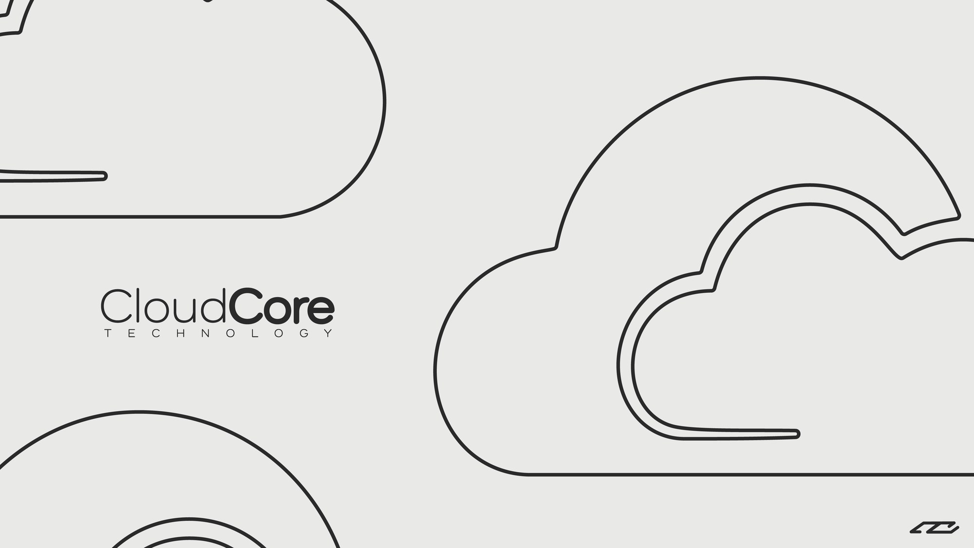
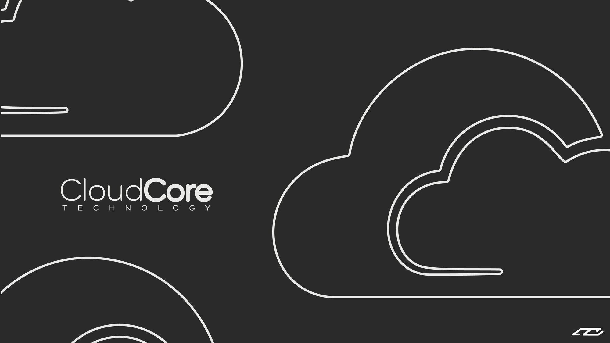
The mark, two symbols, one system.
The logo combines two primitives, each drawn to carry a specific piece of the brand's meaning. A cloud form with an embedded letter C sits below a set of dashed arches that rise above it. Each element is decodable in isolation; together they assemble into a single readable mark.

A network above storage, drawn as one shape.
The arches above and the cloud below carry the two halves of what a cloud-infrastructure company actually does. The arches stand for the network: data moving between endpoints. The cloud stands for the storage layer: data at rest. Reading them together reads as what the company is.
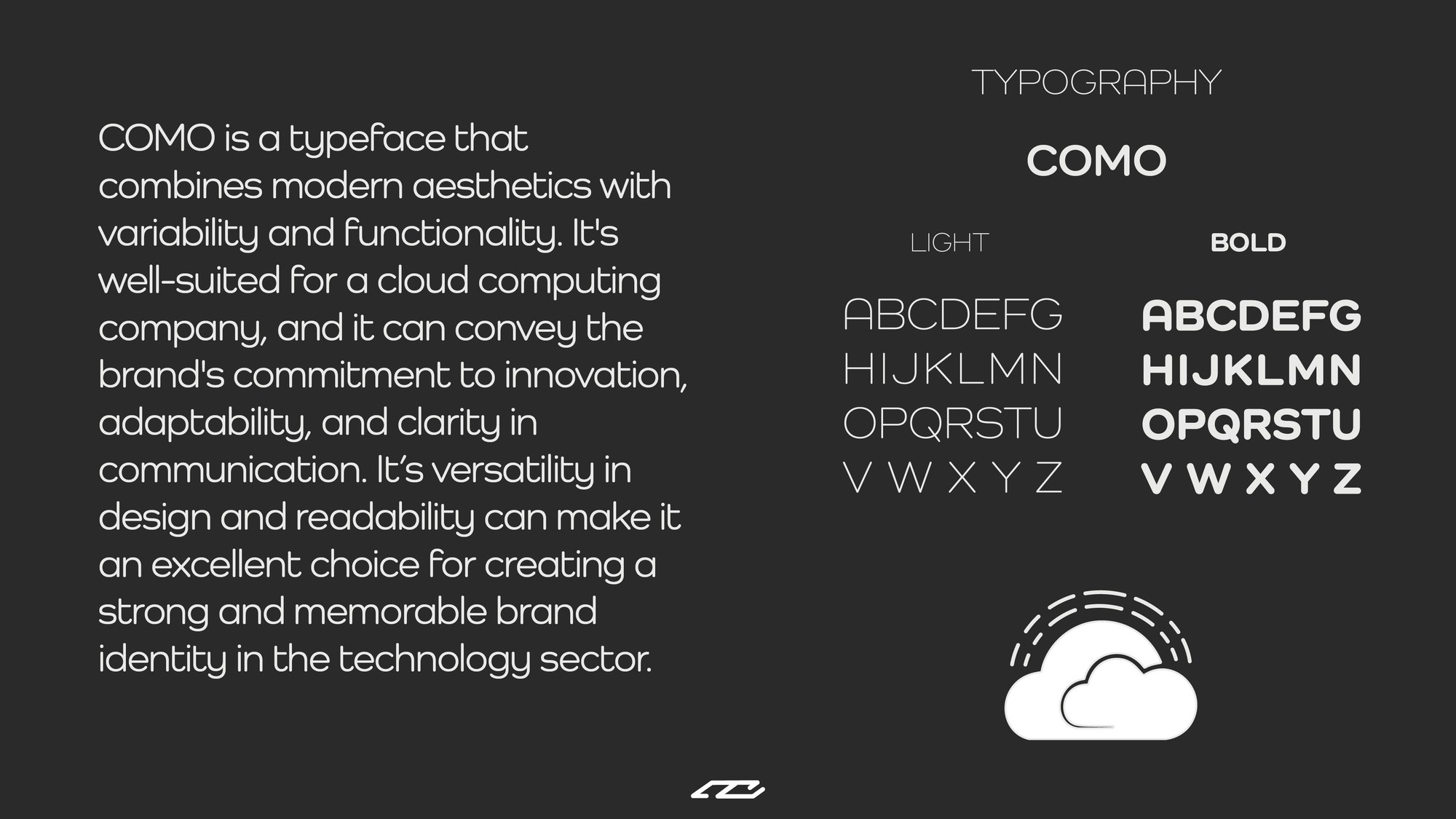
The wordmark, COMO, light and bold.
The brand runs on COMO, a contemporary sans drawn to pair with the geometry of the mark. Selected for a combination of modern aesthetics, variability, and functionality, it was well-suited to a cloud-computing company: clean enough to carry technical language, confident enough to hold a brand wordmark at size, versatile enough to move between interface, print, and signage without needing a second family.
Light and bold weights split the hierarchy. CloudCore uses the bold for Core and light for Cloud, making the core of the product the emphatic half of the wordmark. A small typographic decision that carries a specific reading of what the brand is actually selling.
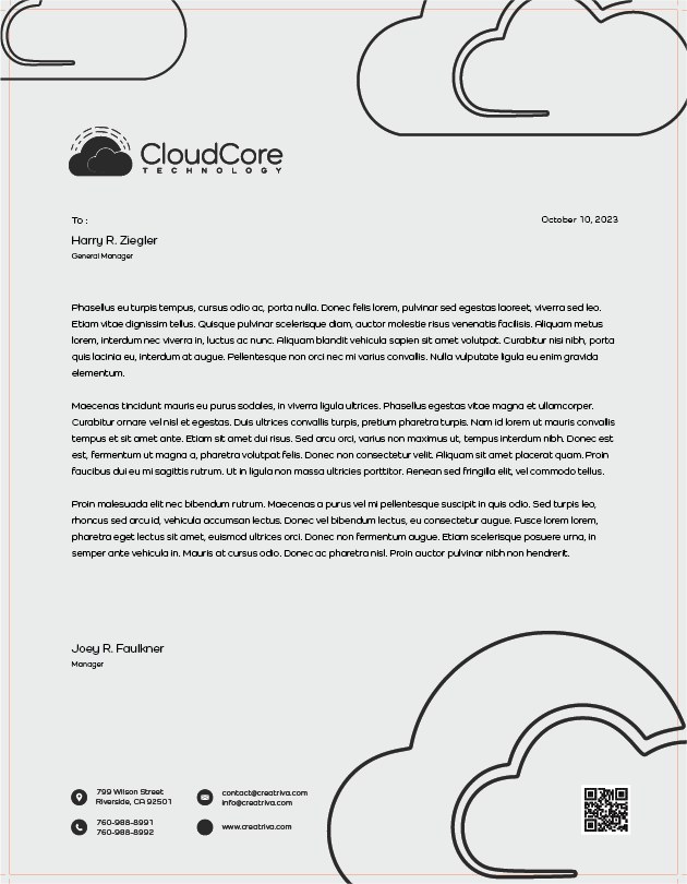
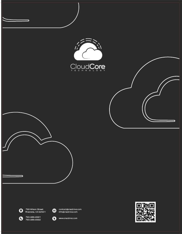
Lockup family, four surfaces, one voice.
The mark lives in two orientations: vertical for tight-column placements like app icons, social avatars, and stacked signage, and horizontal for wide-column placements like letterheads, email signatures, and cards. Each orientation has a light-ground and dark-ground variant. Together, four lockups cover every placement context without requiring the mark to be reworked on the fly.
Applications, the system, in the world.
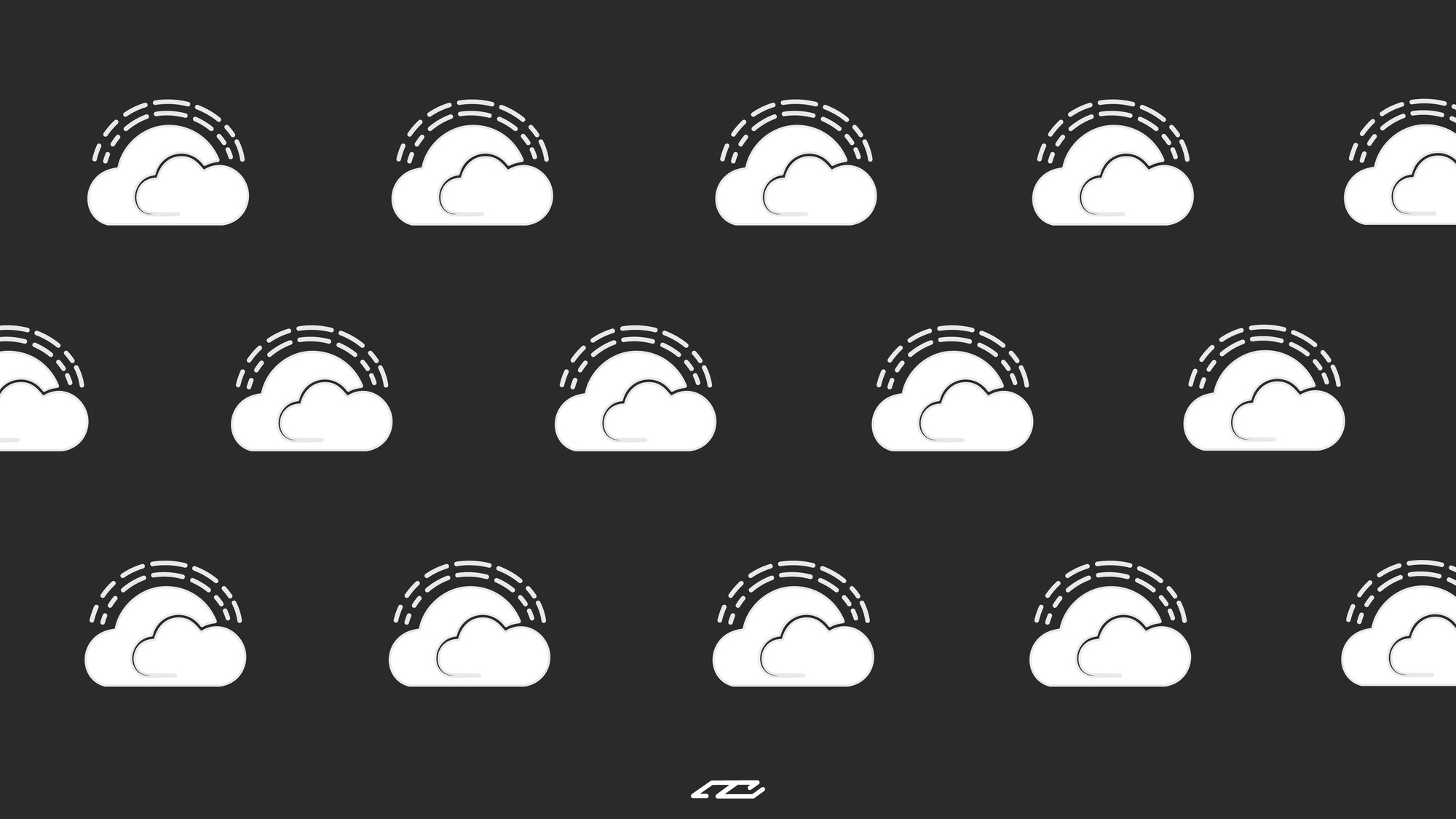
Identity work proves itself when it leaves the logo sheet. Below are the surfaces the CloudCore system was applied to: apparel, dual-palette business cards, stationery in two layout variants, and the tiled pattern system built for backgrounds, packaging, and environmental fill.
Motion, the logo, assembled.
A static mark is one reading of an identity. The motion version adds a second, showing how the components assemble and establishing a rhythm for broadcast, intro cards, app launches, and any surface where the brand introduces itself rather than just appears.
What the piece shows, in numbers.
What the piece shows is scope: how far the system was built out, and what surfaces it holds across. A direct measure of the identity's completeness, the breadth and depth of work that defines a comprehensive brand engagement at this level.
symbols drawn
lockup variants
surfaces built
version delivered
CloudCore is what comprehensive brand work looks like when every surface is considered. From the single symbol that holds the identity together, to the cards in your hand, to the motion that introduces the brand on screen, to the signage that lives at lobby scale. This is the level of finish, depth, and care that any client engagement with NCDSGNS comes back to.