Front cover · Digital + streaming
Logo design, EP artwork, single cover, and video production for Before the Winter, a contemporary Christian rock band based in Kansas. A multi-deliverable creative engagement rather than a single album sleeve.
Before the Winter is a contemporary Christian rock band based out of Kansas. The engagement started where band-identity work should start. Not with an album cover, but with a mark the band could carry from release to release, into merch, social avatars, stage backdrops, and future work that hadn't been written yet. Once the mark existed, the covers, credits, and video work followed from it.
The scope grew across the year to include the Skyline EP artwork, the Expose Me single, the back-cover tracklist layout, and video production for the EP's release. A single-project relationship became a recurring one because the foundation, the logo, was built to hold more than one release.
The band needed a logo that could communicate the meaning their music is reaching for without resorting to the iconography that Christian rock usually defaults to. The brief: something that reads as rooted, patient, and built for the long form, without genre cliché.
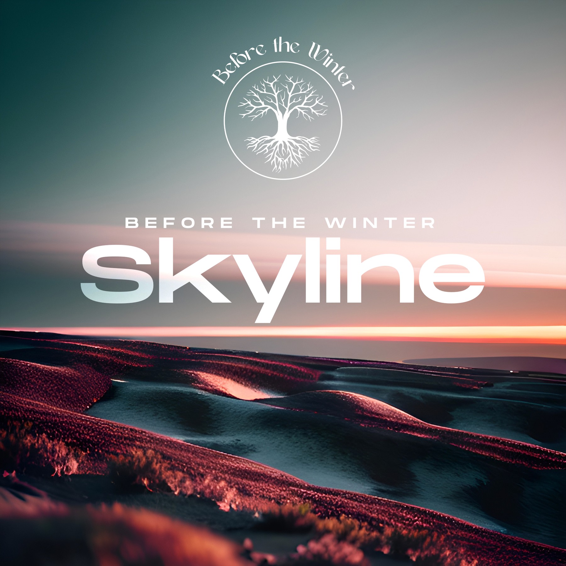
A tree inside a circle, with "Before the Winter" arched in script above it. The type wraps the mark without decorating it. The circle already holds the composition.
Equally workable at album-cover size, tee-chest size, and social-avatar size. Black on white for print and merch, white on black for stage and digital.
Contemporary Christian rock band "Before the Winter" needed a logo to represent them as a group and communicate meaningful imagery that is embodied in the themes of their music.
Using a circle, a shape with no beginning or end, symbolizes unity and wholeness. It suggests that something is complete, continuous, and eternal.
By incorporating a tree within a circle, I created a sense of balance and harmony. The circle represents cycles and continuity, while the tree represents growth and vitality. This combination suggests a band that values both stability and growth, working together to create music in a harmonious way.
Each cover started as a landscape composition: a complete image capable of holding the emotional weight of the record on its own. The tree-of-life mark was added as the final layer, once the landscape read correctly. Below are the raw covers alongside the finished versions, where the design decision is visible in the contrast.
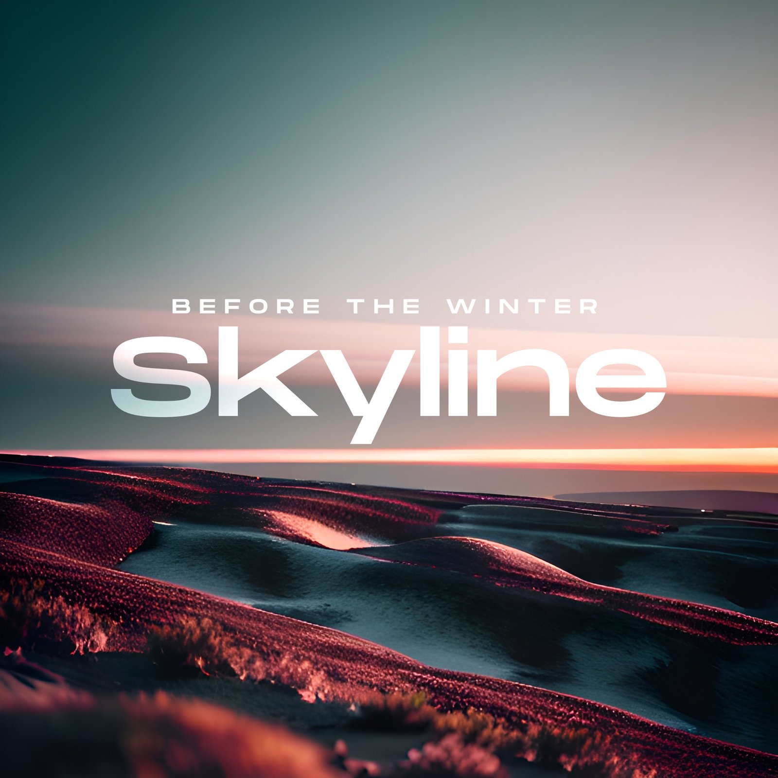
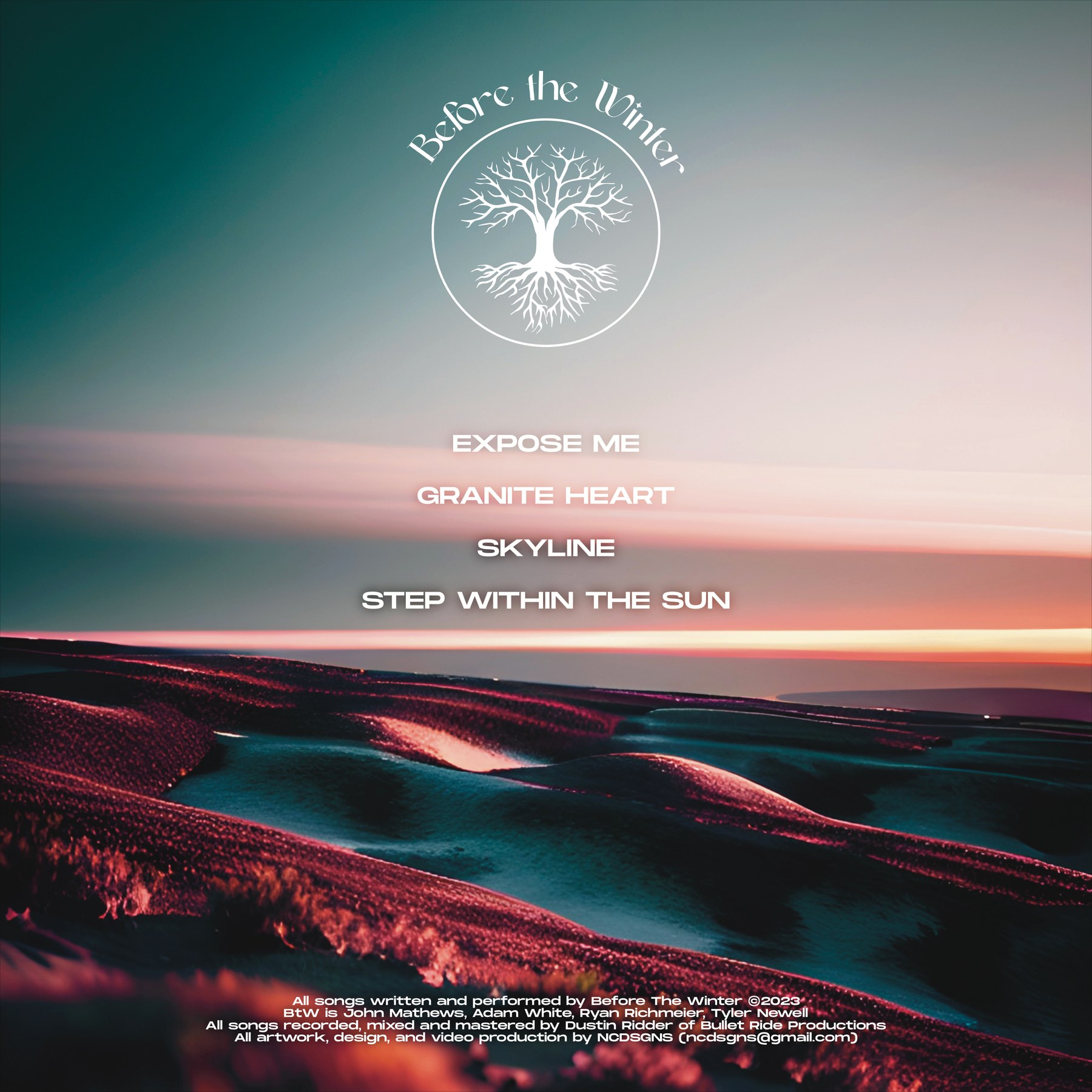
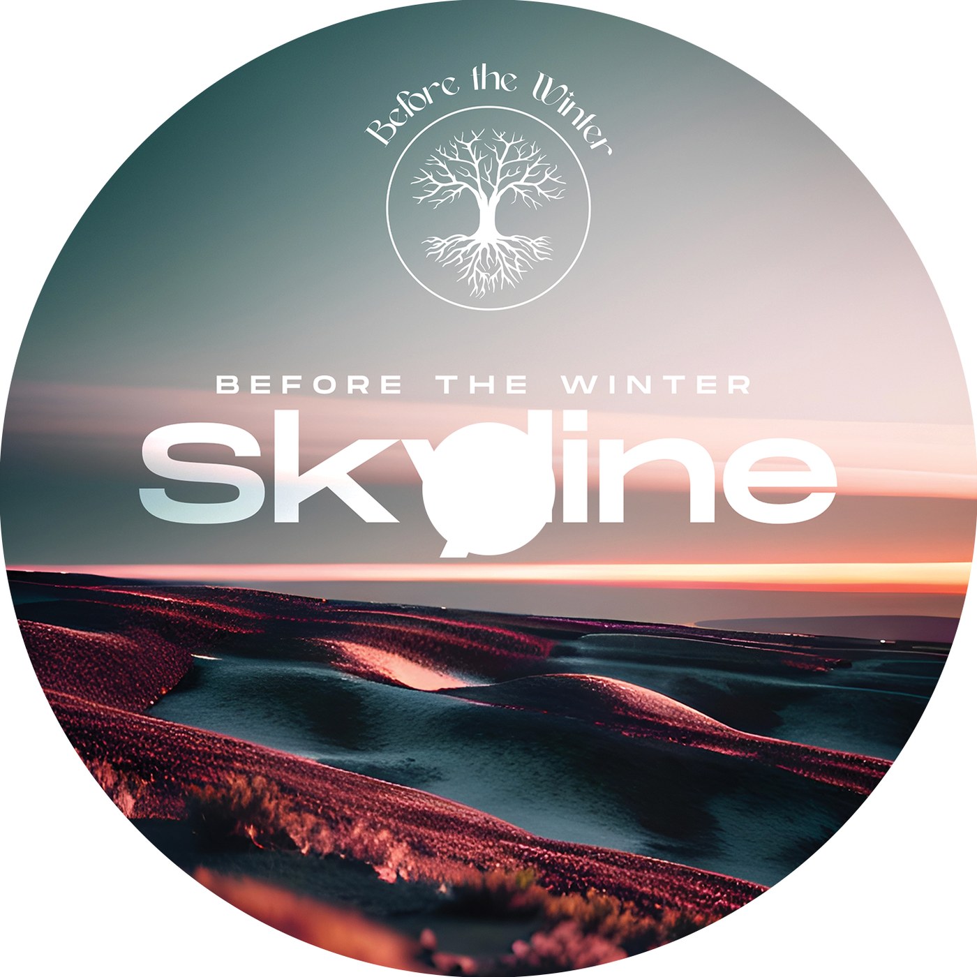
Skyline is the band's EP, four tracks recorded with Dustin Ridder at Bullet Ride Productions. The artwork was built around a landscape the band would actually recognize: Kansas terrain at dusk, when the sky still holds the teal of day along the top while the sunset pulls the horizon into warm rose. It's a real skyline, not a stock one.
The cover reads as one unified composition: the tree-of-life mark centered above the horizon, the word "Skyline" set below in a soft blurred sans that echoes the gradient of the sky itself. Nothing competes for attention; the landscape does most of the work.
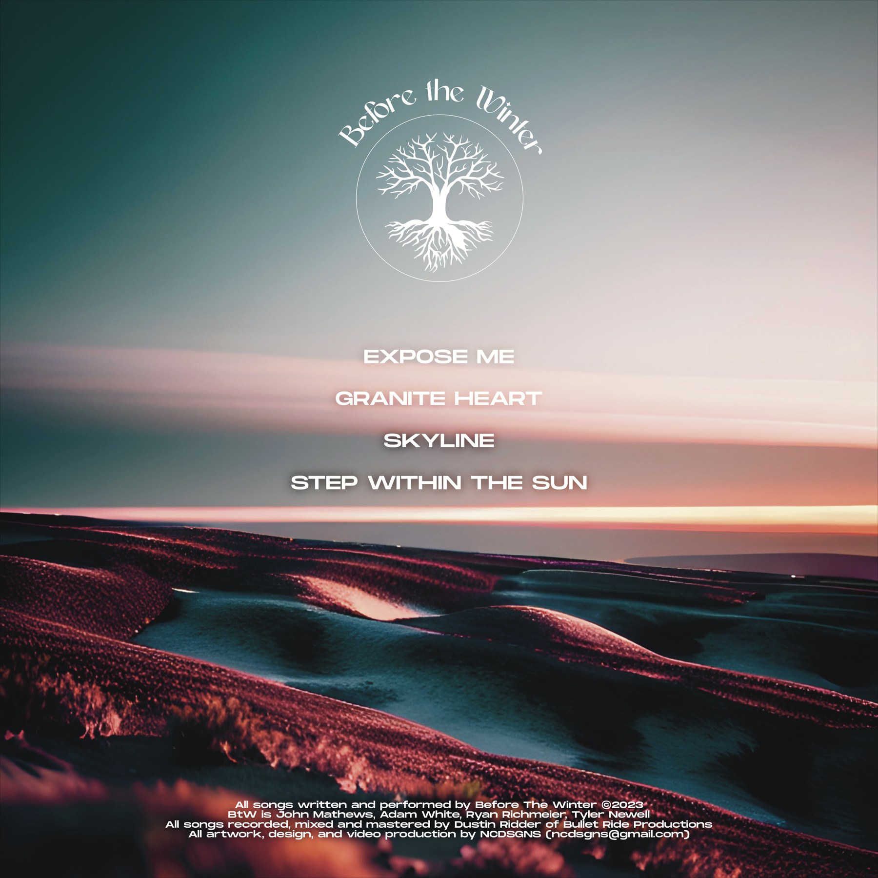
Four tracks, set across a single visual landscape. The front cover carries the identity mark and the record's name; the back cover carries the tracks, the credits, and the horizon extended.
Released with full design and video production handled in-house at NCDSGNS.
The Skyline system was built across the full set of surfaces a physical release actually ships on: front cover for digital and streaming, back cover with tracks and credits, and CD face for the physical edition.
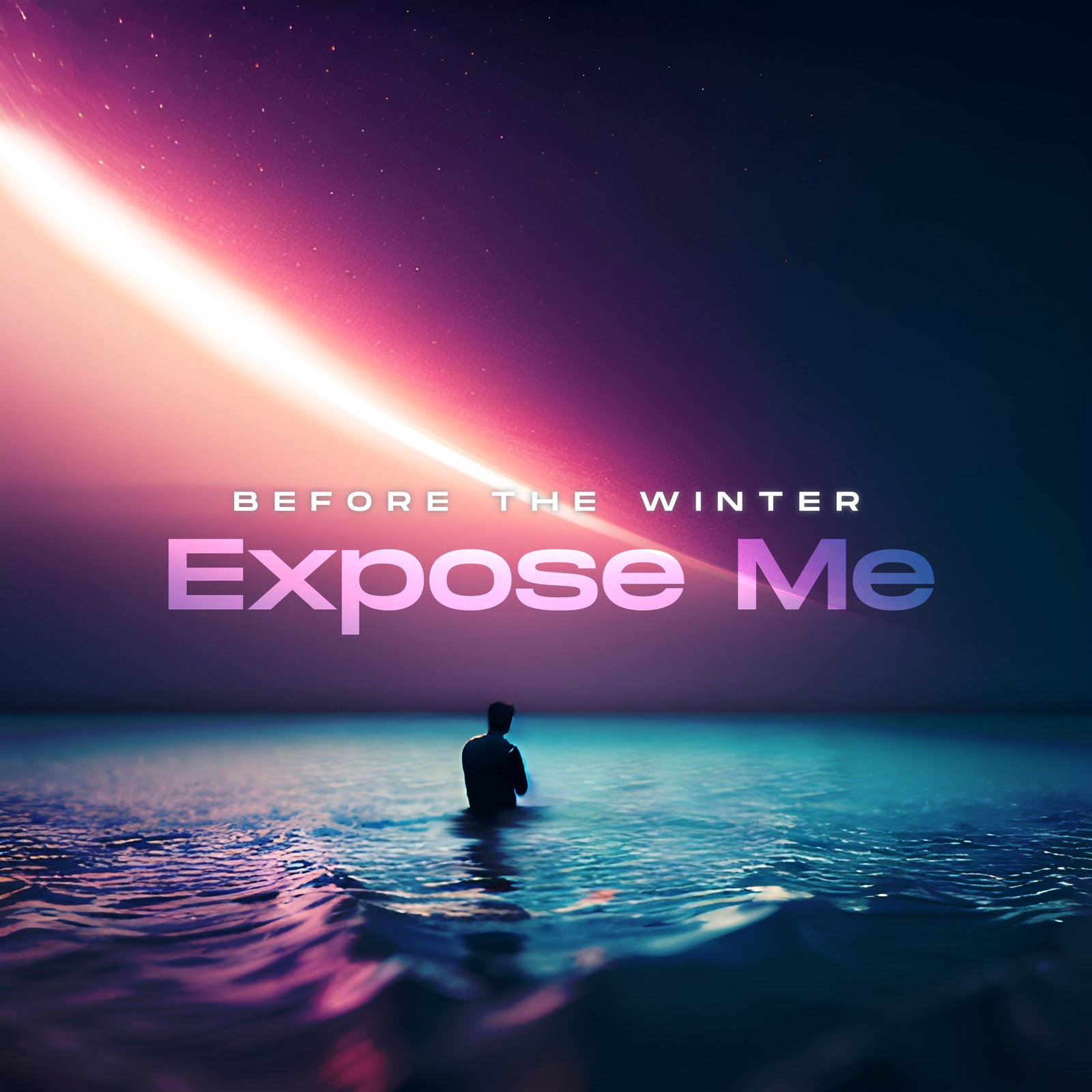
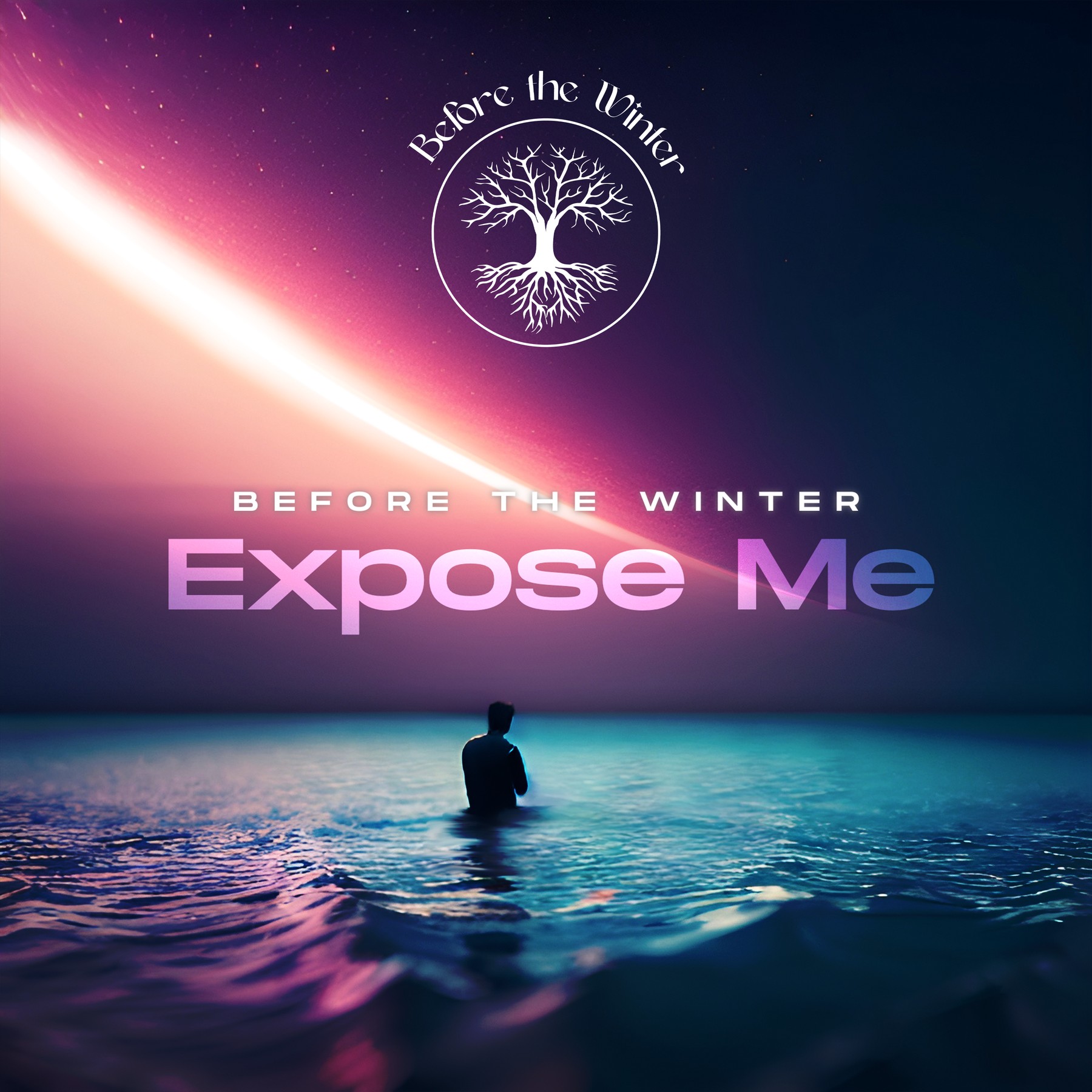
Expose Me is the EP's opener and also the release that got its own dedicated single artwork: a second cover living in a different aesthetic universe from the EP it appears on. Where Skyline is earth and horizon, Expose Me is atmosphere and deep space, a figure in water under a pink-into-cyan cosmic sky with a ringed body of light overhead.
Holding both covers inside one band identity is part of the work. The tree-of-life mark is the constant; the landscapes underneath it are allowed to shift register. The system was built to flex this way on purpose.
Same identity mark, entirely different visual temperature. Where Skyline reads as grounded and warm, Expose Me reads as suspended and cool, holding the emotional register of the song rather than inheriting the EP's landscape.
The tree-of-life stays at the top of the composition in both covers. Everything else is allowed to move.
The color system across the two releases was not built to match. It was built to read as the same family while holding two distinct emotional registers: Skyline grounded in terrain, Expose Me suspended in atmosphere. Below are the five values carried through the work.
Designing for a band you've listened to is different from designing for a client whose product you've never used. You already know what the record is supposed to feel like by the time you open the file. The job is to not get in the way of it.